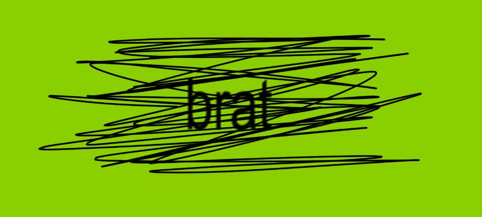
Using a black background with white text is a bold visual choice. It creates high contrast and a modern look that can make brat styled text feel sharper and more dramatic. This style is common in social posts, story overlays, thumbnails, and meme graphics where impact and mood matter more than long form readability.
Before you choose this look it helps to know the facts. The Web Content Accessibility Guidelines explain how to measure sufficient contrast between text and background. The official WCAG guidance shows that normal text should have a contrast ratio of at least 4.5 to 1 for level AA. For large text the minimum is 3 to 1. You can read the WCAG contrast requirements on the W3C site. W3C
WebAIM provides an accessible summary and tools to check contrast. Pure white on pure black meets and exceeds WCAG requirements easily because the contrast ratio is very high. However accessibility is about more than ratio alone. WebAIM also recommends attention to font weight, letter spacing, and text size for the best experience. WebAIM+1
Nielsen Norman Group points out that dark themes can be useful in low light situations but they are not always better for long reading. Visual performance tends to be stronger with dark text on a light background for extended reading tasks. That means black background white text is excellent for short form content such as captions, banners, and overlays but may not be ideal for long paragraphs. Nielsen Norman Group
Material Design by Google includes best practices for dark themes that go beyond color values. The guidelines explain how to use surfaces, elevation, and contrast to keep interfaces readable and attractive. Designers often choose softer near black surfaces rather than pure black to reduce glare while retaining a dark mood. Material Design
Why black background and white text works for Brat Generator output
High contrast makes brat styled text punchy and clear. The bright white letters seem to float over the dark field and that enhances attitude and emphasis. For short messages, captions, and meme style images the black background white text combination increases scannability and helps your words register quickly.
Practical examples where this look shines include story overlays on Instagram, thumbnail text for short videos, quick reaction images for group chats, and bold header graphics. For templates and quick shareable images the style reads well across many devices and platforms.
Statista data shows the majority of internet messaging and social consumption happens on mobile. That makes on device contrast and visibility critical. Using white text on a dark background helps preserve visibility on low brightness settings and in dim light. At the same time you should test your designs on actual phones because perceptual effects vary by screen type. forms.app: Free Online Form Builder
Accessibility and readability tips to follow
-
Check contrast ratios using a reliable tool. Make sure your text meets WCAG standards for the text size you are using. The WebAIM contrast checker is a practical option. WebAIM
-
Prefer slightly off white for long text. Pure white can create glare on some screens. Using a near white can reduce visual fatigue while keeping high contrast. Material Design recommends thoughtful color choices for dark surfaces. Material Design
-
Increase font size and weight for body text. Small thin type on a dark field becomes harder to read. Larger and bolder letters improve legibility and user comfort. The WCAG success criteria explain the difference between normal and large text. W3C
-
Add letter spacing and line height. Gentle tracking and comfortable line height reduce crowding and make text easier to scan. This is especially important for stylized fonts used by the Brat Generator.
-
Test on multiple devices and in different lighting. What reads well on an OLED phone at night can be harder to read on a laptop in daylight. Nielsen Norman Group advises testing dark themes in realistic conditions. Nielsen Norman Group
Design choices to enhance the brat aesthetic
Use high contrast for primary lines and softer accents for secondary details. For example, keep your main phrase in white and use a light gray for supporting captions. This guides the viewer to the most important words without overwhelming the eye.
Consider using texture or subtle shadows sparingly to add depth. Pure flat white on black has great contrast but adding a faint shadow or outline can increase perceived clarity on lower quality displays. Material Design discusses elevation and surface treatment for dark themes that can guide these decisions. Material Design
If you plan to offer a downloadable font or image from the Brat Generator consider providing both a dark mode and a light mode version. This gives users flexibility and reduces the risk of poor contrast in different contexts. You can manage downloads and font assets through the Brat font download page. Internal link to that resource helps users find the right files quickly. Accessible Web
Quick checklist before you publish an image
-
Confirm contrast ratio meets WCAG for the size and weight of your text. Use WebAIM or Deque tools to verify. WebAIM+1
-
Test on a smartphone with low brightness settings.
-
Increase type size if the text contains long phrases.
-
Avoid thin hairline fonts for long captions on a dark field.
-
Provide an alternative description when posting for accessibility. This helps screen reader users understand the content.
Where to try it now
Create a quick sample using the main tool at the Brat Generator homepage. The generator is ideal for experimenting with contrast and style in real time. For text only usage try the Brat Text Generator page. If you want downloadable fonts for your own editing workflow visit the Brat Font Download page on the site.
Internal links you can use now
• Brat Generator home page
• Brat Text Generator
• Brat Font Download
External resources for further reading and testing
• WCAG contrast guidelines on the W3C site. W3C
• WebAIM article and contrast checker for practical tests. WebAIM+1
• Nielsen Norman Group research on dark mode and usability. Nielsen Norman Group
• Material Design dark theme guidance from Google.
Best Practices, Use Cases and Important Considerations
When Black Background with White Text Works Best
Using a black background with white text creates a bold and modern look. This combination attracts attention quickly and fits perfectly in many creative situations, especially when you want your message to stand out with a strong visual presence. You can use this style effectively in the following cases:
-
Social media posts
-
Story updates on popular platforms
-
Video thumbnails
-
Bold quotes and captions
-
Meme style graphics
-
Dark mode friendly visuals
This color pairing offers strong contrast that helps the text appear crisp on digital screens. Many users also prefer dark visuals when browsing at night since bright backgrounds can cause discomfort. Research on dark mode design supports this idea and explains that dark backgrounds can reduce glare and improve user comfort in low light environments. You can read more in the dark mode analysis published on Smashing Magazine which explains how dark themes improve the reading experience in specific contexts. Source:
Inclusive Dark Mode Design
What Accessibility Guidelines Recommend
Accessibility is essential when choosing a color combination for text. The World Wide Web Consortium provides clear guidance on minimum contrast levels for text. According to the WCAG standards, standard sized text should maintain a minimum contrast ratio of four point five to one. Larger text can go slightly lower at three to one. Source:
Understanding Contrast Minimum
Pure white text on pure black background easily meets this requirement which makes it a very safe choice from an accessibility point of view. This high contrast improves readability for users with low vision or other visual challenges. The same W3C resource further explains how contrast standards support inclusivity across a wide range of devices.
However, accessibility involves more than simple contrast. Some users may experience discomfort when reading very bright white text on deep black for long periods. This visual effect is known as halation. It is especially noticeable for people with conditions like astigmatism. A detailed explanation of this effect can be found in Flatline Agency’s article about the advantages and limitations of dark mode. Source:
Dark Mode Design Benefits and Considerations
Tips for Using Brat Generator with Black Background Effectively
To make sure your brat styled text remains visually strong and easy to read, consider the following suggestions:
-
Use a larger font size for improved readability
-
Prefer slightly softer white shades for longer reading sessions
-
Maintain proper letter spacing and comfortable line height
-
Avoid using busy or textured backgrounds behind the text
-
Apply black background brat text mainly for short content and quick messages
-
Choose light backgrounds when preparing long paragraphs or educational content
When a Light Background Can Be More Suitable
Although black background visuals look strong and modern, they are not always the best choice for extended reading. Research suggests that dark text on light backgrounds offers better clarity for detailed reading tasks. Wired published an interesting breakdown about this that discusses how dark mode affects visual performance depending on environment and task type. Source:
Do You Really Need Dark Mode
In bright environments a light background usually performs better and feels more comfortable. This is why many platforms provide a toggle that allows users to switch between light and dark modes. The OKMG design insights highlight how giving users control over theme selection improves comfort and supports accessibility. Source:
Impact of Dark Mode in Web Design
Why Brat Generator Offers an Advantage
The Brat Generator gives users full freedom to choose their preferred style. Whether you want a bold black background with white text or a softer light background, the tool provides flexibility that suits any project. This versatility is ideal for creators who work across different platforms and audiences.
A Balanced Approach to Style
The best results come from balancing creativity with user comfort. Black backgrounds with white text work brilliantly for short, impactful content. Light backgrounds support readability for longer messages. When used with intention, the Brat Generator helps you create visually impressive and accessible text for every platform.

Farman Ali is an experienced SEO Specialist with more than 6 years of expertise in helping businesses grow their online presence, improve search visibility, and enhance their AI visibility across digital platforms to achieve sustainable growth.
He started his career as an SEO intern at an IT company, where he learned the fundamentals of SEO, keyword research, and website optimization. His passion for digital growth led him to work at a digital marketing agency, where he managed multiple client projects from different industries. There he developed strong skills in technical SEO, on page optimization, content strategy, and AI based visibility, consistently delivering measurable improvements in search performance.
Over the years, Farman has worked with international brands and led successful SEO campaigns that increased organic traffic, improved keyword rankings, and boosted conversions. His expertise covers modern SEO practices including SXO (Search Experience Optimization), AEO (Answer Engine Optimization), and GEO (Generative Engine Optimization). These skills allow him to help brands perform effectively across traditional search, voice search, and AI powered search environments.
Farman’s core strengths include technical SEO audits, AI enhanced visibility strategies, SXO improvement, keyword mapping, and data analysis using tools such as Google Analytics, Google Search Console, SEMrush, Ahrefs, and Screaming Frog. He also specializes in creating content strategies aligned with user intent and search behavior, ensuring that websites not only attract traffic but also convert visitors into loyal customers.
He keeps himself updated with the latest Google algorithm changes, AI advancements, and SEO innovations to ensure that every strategy remains effective and future focused.
Farman believes that SEO is more than just rankings. It is about building trust, visibility, and consistent growth for brands across all digital platforms. His mission is to help businesses strengthen their online presence, gain authority in their niche, and achieve long term success through smart SEO, SXO, AEO, and GEO strategies that align with the future of digital search.